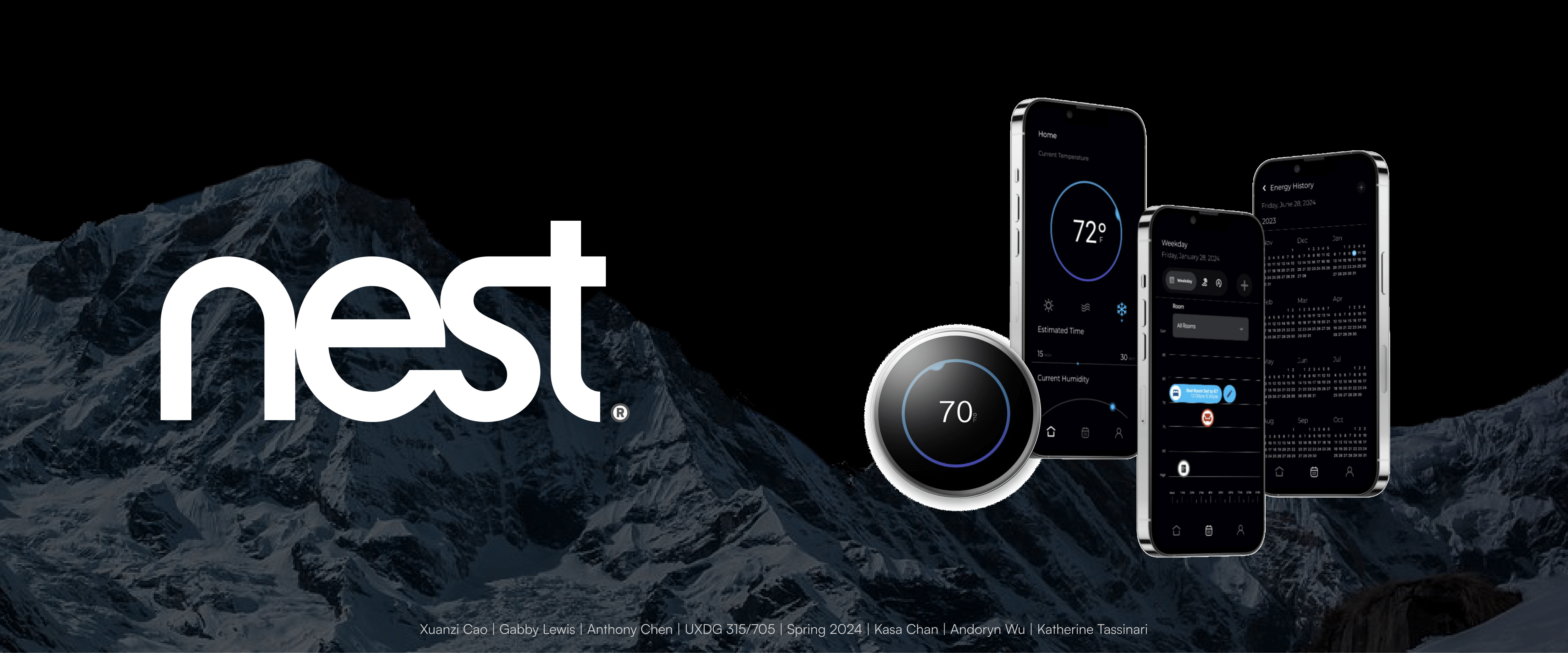
NEST Thermostat Redesign
NEST Thermostat UI Study and Redesign
"The Science of Aesthetics in UI Design"
Project Overview
My Role: Project Manager, UX Designer
Team: Gabby Lewis, Anthony Chen, Andoryn Wu, Xuanzi Cao, Kasa Chan
Timeline: 10 weeks
The Challenge
How might we redesign the Nest UI to be more high-end, innovative, and user-friendly while maintaining the existing hardware constraints?
The Scenario
Google decides to divest non-core businesses. Three managers have different ideas to spin off the Nest Thermostat business, each turning to designers to build a concept to help sell their vision.
Design Constraints
- Hardware remains unchanged
- Design for both embedded and iPhone interfaces
- 3 required screens: Home, Global Navigation, Manual Scheduling
- Embody "high-end" and "innovative" aesthetics
Research Question
What makes a UI design objectively "high-end" and "innovative"? Can these subjective qualities be scientifically quantified through systematic analysis?
Research Methodology
We developed a systematic approach to quantify subjective design qualities, analyzing over 380 images to identify data-driven design patterns.
Quantitative Design Analysis
Our methodology involved collecting over 380 images of interfaces perceived as "high-end" and "innovative," then systematically analyzing them to identify common visual traits and patterns.
Data-Driven Insights
This extensive mood boarding led to the creation of quantifiable data points, which were distilled into actionable design directives. The process proved that subjective aesthetic qualities can be objectively measured and replicated.
Key Discovery
What makes a successful UI "high-end" or "innovative" can be scientifically quantified through systematic visual analysis. This approach transforms subjective design decisions into objective, data-backed choices.
What makes a successful UI, and what makes a UI "high-end", or "innovative", can be scientifically quantified. As a nerd, I found this really cool. It makes the subjective objective.
— Key insight from research methodology
Design Framework
Research-driven design directives translated into a systematic framework for high-end UI aesthetics.
Color Scheme
Monochromatic with vibrant accents
Color Contrast
High contrast ratios
Font Weight
Thin typography
Theme
Dark mode aesthetic
Typeface
Sans serif fonts
Framework Application
These data-driven directives guided every design decision, ensuring consistency across both embedded and mobile interfaces. The chosen design emphasized a sleek, dark mode with shades of blue and purple to convey a futuristic, high-end feel.
Cross-Platform Considerations
We mapped out user flows for both platforms, learning about embedded interface inputs from scratch—a significant challenge compared to familiar phone and desktop interactions.
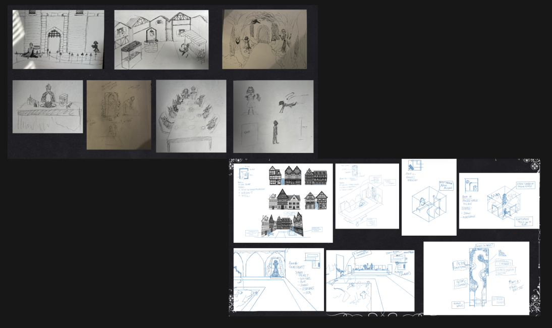
Design Process
1
Research & Analysis
Collected and analyzed 380+ images to identify quantifiable patterns in high-end and innovative UI design. Created data points and design directives from findings.
2
Individual Concept Development
Each team member proposed individual UI concepts. We selected the most promising design that emphasized sleek dark mode with blue and purple accents.
3
User Flow Mapping
Mapped user flows for both embedded and mobile platforms, learning embedded interface constraints and input methods from scratch.
4
Testing & Iteration
Conducted usability testing using System Usability Scale (SUS) questionnaire. Used SUS scores to allocate resources and prioritize interface improvements.
Testing & Results
Usability Testing Methodology
Conducted comprehensive usability testing using the System Usability Scale (SUS) questionnaire, combined with observation and user interviews to gather both quantitative and qualitative feedback.
Key Findings
The embedded interface received higher usability scores compared to the mobile app. This unexpected result led us to concentrate our refinement efforts on improving the mobile UI experience.
Resource Allocation Strategy
Used SUS scores as a data-driven method to allocate development resources effectively, focusing improvement efforts where they would have the greatest impact on user experience.
Component Library Development
Created a comprehensive component library to maintain consistency throughout development, ensuring sleek aesthetics and correct color application across all platforms and screens.
Key Learnings
Establish Decision-Making Processes Early
This project underscored the importance of having backup decision-making strategies to save time and ensure efficiency. We used voting systems for decisions, with coin flips as tie-breakers for fairness.
Large Teams Require Structure
Managing a 6-person team taught me valuable lessons about coordination and decision-making in collaborative settings. Clear processes and adaptability are essential for team success.
Research Can Quantify Subjective Qualities
The systematic analysis of aesthetic qualities proved that "high-end" and "innovative" design can be objectively measured and replicated through data-driven research methodology.