The Brief
The Scenario
Google decides to divest non-core businesses. Three managers have different ideas to spin off the Nest Thermostat business. Each manager turns to designers to build a concept to help them sell their idea.
The Constraints
1. The hardware remains unchanged.
2. Design for both the embedded and iPhone interfaces.
3. 3 screens included: Home, Global Navigation, Manual Scheduling.
The Opportunity
How might we redesign the Nest UI to be more high-end, innovative, and user-friendly?
Discover
Moodboarding
We started by defining what constitutes a “high-end” and “innovative” design. This involved collecting over 380 images and analyzing them to identify common traits. Our extensive mood boarding led to the creation of data points, which were distilled into design directives. We then crafted a final mood board to guide our redesign.
Define
Design Directives
Based on our research, we established the following design parameters:
Color Scheme: Monochromatic with vibrant accents
Color Contrast: High
Font Weight: Thin
Theme: Dark
Typeface: Sans Serif
Key Insight
What makes a successful UI, and what makes a UI "high-end", or "innovative", can be scientifically quantified. As a nerd, I found this really cool. It makes the subjective objective.
Develop
First Pitches
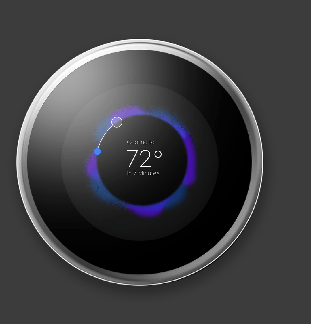
We each proposed individual UI concepts, from which we selected the most promising design. The chosen design emphasized a sleek, dark mode with shades of blue and purple to convey a futuristic, high-end feel.
User Flow
We mapped out the user flow for both platforms, which was a challenge because we had to learn about the inputs of the embedded interface from scratch, as opposed to the phones and desktops we were used to designing for.
Key Insight
The exercise produced actionable insights that guided our design process, resulting in a user experience that was both emotionally engaging and functionally effective.
Testing and Iteration
We iterated through multiple prototypes, using SUS scores to allocate resources and refine the experience.
Usability testing was conducted using the System Usability Scale questionnaire, along with observation and interviews. We discovered that the embedded interface received higher usability scores compared to the mobile app. Consequently, we concentrated our efforts on refining the mobile UI.
Component Library
In order to keep consistency throughout the development process, we created a component library for our UI design, which kept the aesthetic sleek and the colors correct across all platforms and screens.
Deliver
Final Deliverables
Insights
Establish decision-making processes before you start.
This project underscored the importance of having backup decision-making strategies to save time and ensure efficiency. We initially used a voting system for decisions, but when we encountered ties, we used a coin flip for fairness.
Large teams can be challenging but rewarding.
This experience taught me valuable lessons about managing larger teams and handling complex design challenges, reinforcing the need for clear decision-making processes and adaptability in a collaborative setting.


.svg)